Le voyage à Paris
Visual Identity for the British Sailing Team at the Paris 2024 Olympics
Studio
KYAK
Client
British Sailing Team
Sector
Sports Industry
Services
Visual Identity
Brand Design
Poster Design
Social Assets
Background
The British Sailing Team — the most successful Olympic sailing nation of all time — were one of the first clients that Rob Page brought on board when he launched KYAK Studio back in 2020. In that year he worked alongside the BST marketing team on their Tokyo 2020 Olympic Games campaign, doing such a great job that, when Paris 2024 was on the horizon, he was called upon again to help build on their previous success.
Having worked with Rob on many projects in the past — and helping him develop the KYAK identity — he called me in to lead the creative on this particular project based on my past experience in building visual identities, while he applied his focus on the running and building of his design studio.
Brief
The brief was to build on the success of the Tokyo campaign and create an identity for the Paris 2024 Olympics — something that first and foremost represents sailing and the team, while also clearly depicting Paris as the destination — that can be developed and applied to a wide range of print and digital assets. Including a series of posters for all members of the team and an array of social media assets for their digital marketing team to use before, during and after the Paris campaign.
Solution
Looking at the official Paris 2024 Olympic logo for inspiration, focusing on the circular nature of it and the interesting use of negative space. These were some of the key elements considered while developing the initial concepts.
Of the two alternative routes presented, the chosen concept was considered to be more closely aligned to the brief. This began with taking inspiration from the circular shapes of the Olympic rings and converging them in such a way to form the recognisable shape of the Eiffel Tower.
Being a widely depicted landmark, I knew it would be difficult to create something truly original, but I was keen to ensure it couldn't be easily confused with anything else within the public domain. To achieve this, I thought about how I could find a unique and meaningful way to use the three counter shapes formed by the lines of Eiffel Tower dissecting the circle. This is where the idea of incorporating "The Elements" first came in.
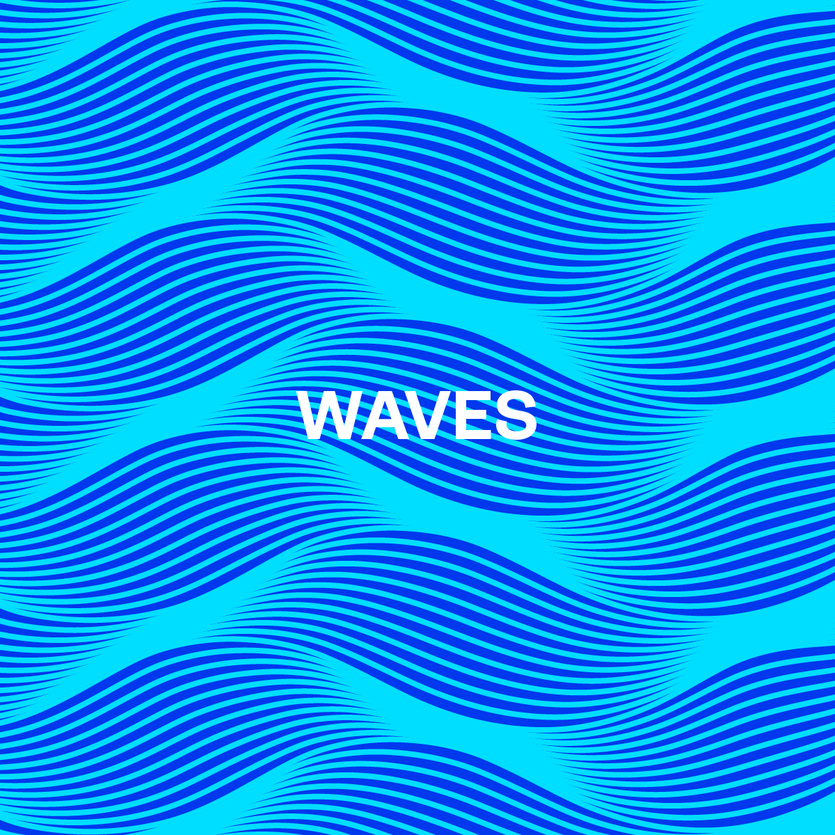
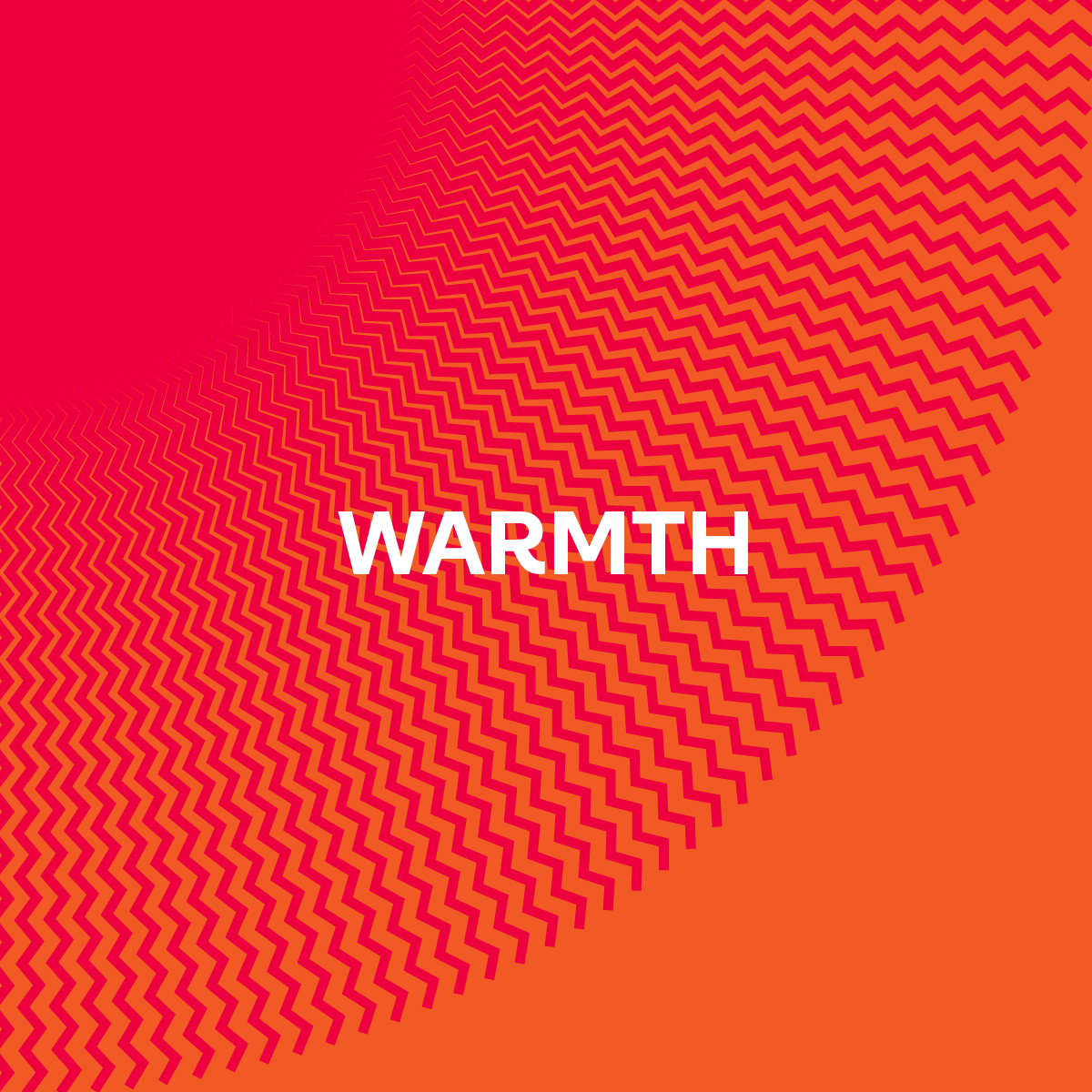
Creating three separate graphic patterns for Waves, Wind, and Warmth to represent the natural elements essential to the world of sailing, bringing them together to form the foundations of this visual identity. The relevance of Wind and Waves within the world of sailing really don't need any further explanation, while the concept of Warmth represents the predominantly warm and sunny location of Marseille Marina, where all sailing events throughout the Olympic Games will take place.
These patterns made the symbol clearly distinctive and different from anything else depicting Paris, also giving more purpose to the outer shapes and connecting them to the very nature of the sport.
It was towards the end of this process that I had one of those serendipitous moments of inspiration and realised that the central shape slightly resembled a sail. With this in mind, I created a sail-like device to fit within the central space of the Tower, perfectly positioned above the water with the warmth and wind on either side of the sails.
This was the “pièce de résistance” that helped to create the perfect depiction of the place and purpose of the British Sailing Team in Paris.


Team Posters
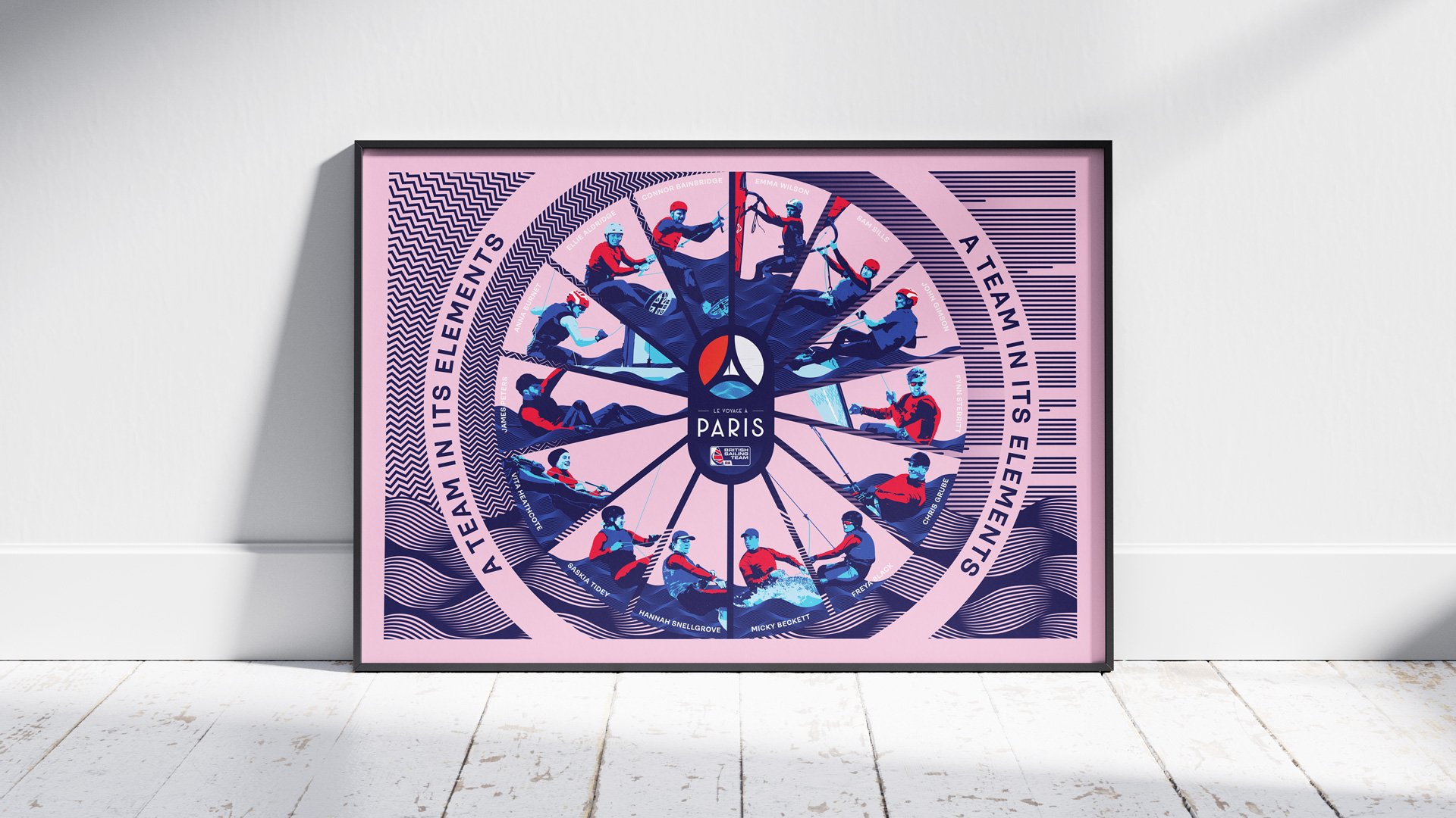
Following the creation of the identity, applying it to the Team posters was one of the greatest aspects of this project. From the outset, I knew I wanted to create a clean, layered effect with the Paris symbol as a fixed point within the design. Curating the best action shots for each of the sailors from recent competitions and events, then converting them into a vectorised versions with the minimal colour palette applied.


