Longwood Maven
Identity for a consultancy supporting trade associations in the UK
Studio
Default Blue
Client
Longwood Maven
Sector
Consultancy
Services
Brand Identity
Background
This project came about as the result of a direct referral from a very happy client. The design and marketing support provided by the Default Blue team (including myself) for this particular consultancy, not only proved our capabilities but also helped to create enough impetus for this agency to aim higher in order to grow and reach more clients in their particular sector.
The general consensus was, that before they could take this next step, it was clear that they needed a stronger and more purposeful identity.
Brief
The brief was to take the original logo design, which was considered a little uninspiring and too masculine for this female-fronted agency, and transform it into something more original, more iconic, with real meaning behind it.
While aiming for something less masculine, the client also made it clear that that this identity needed to fit within a very male-dominated environment, and therefore needed to both stand out and stand toe-to-toe with other organisations within that world, which became quite a tricky balance to strike.
Solution
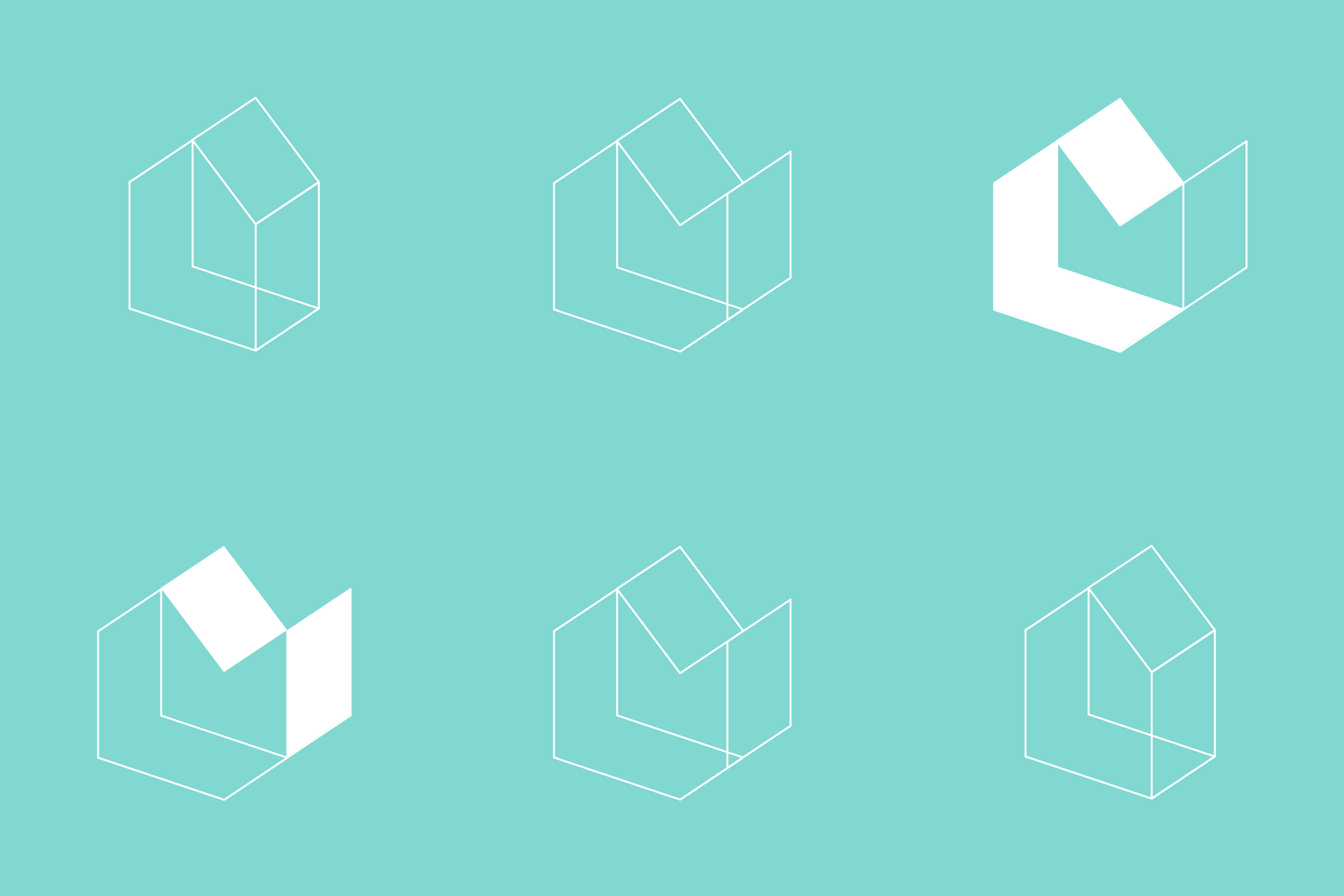
For me, the most logical starting point was to look at where these tradespeople and associations focused their efforts… which was the home. This led me to develop a few isometric shapes, forming house-like structures. It was during this exploratory process that I moved one of the walls and noticed that it looked remarkably like an abstract letter M.
On seeing this, I knew I was onto something and began playing with the shapes a little more, before finally finding a way to form both initial letters of Longwood Maven with one house-like logomark. I chose to pair this with Mori — a versatile and sophisticated gothic sans serif font — from the Pangram Pangram Foundry.


