Jalapeño
Visual identity for IT business based in the East Midlands
Studio
Brand Newark
Client
Jalapeño
Sector
Business Services
Services
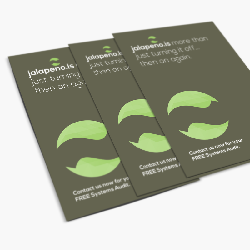
Brand Identity
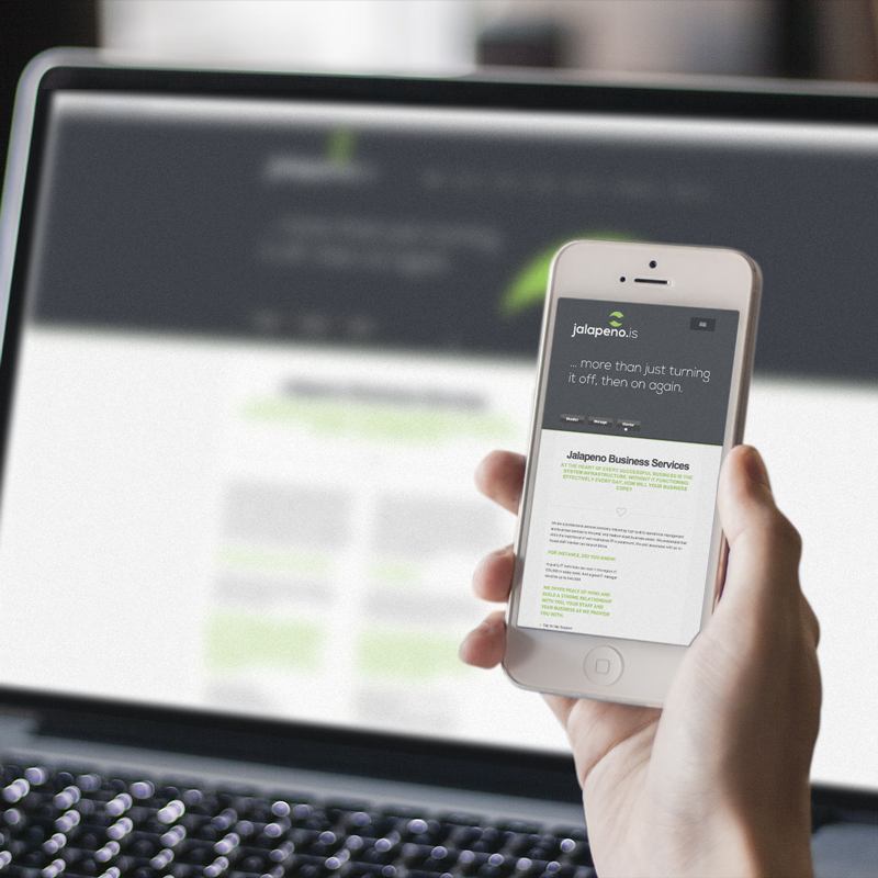
Website Design
Background
Originally set-up as a father and son venture, this Newark based IT company provided specialist technical support for the local business community.
Brief
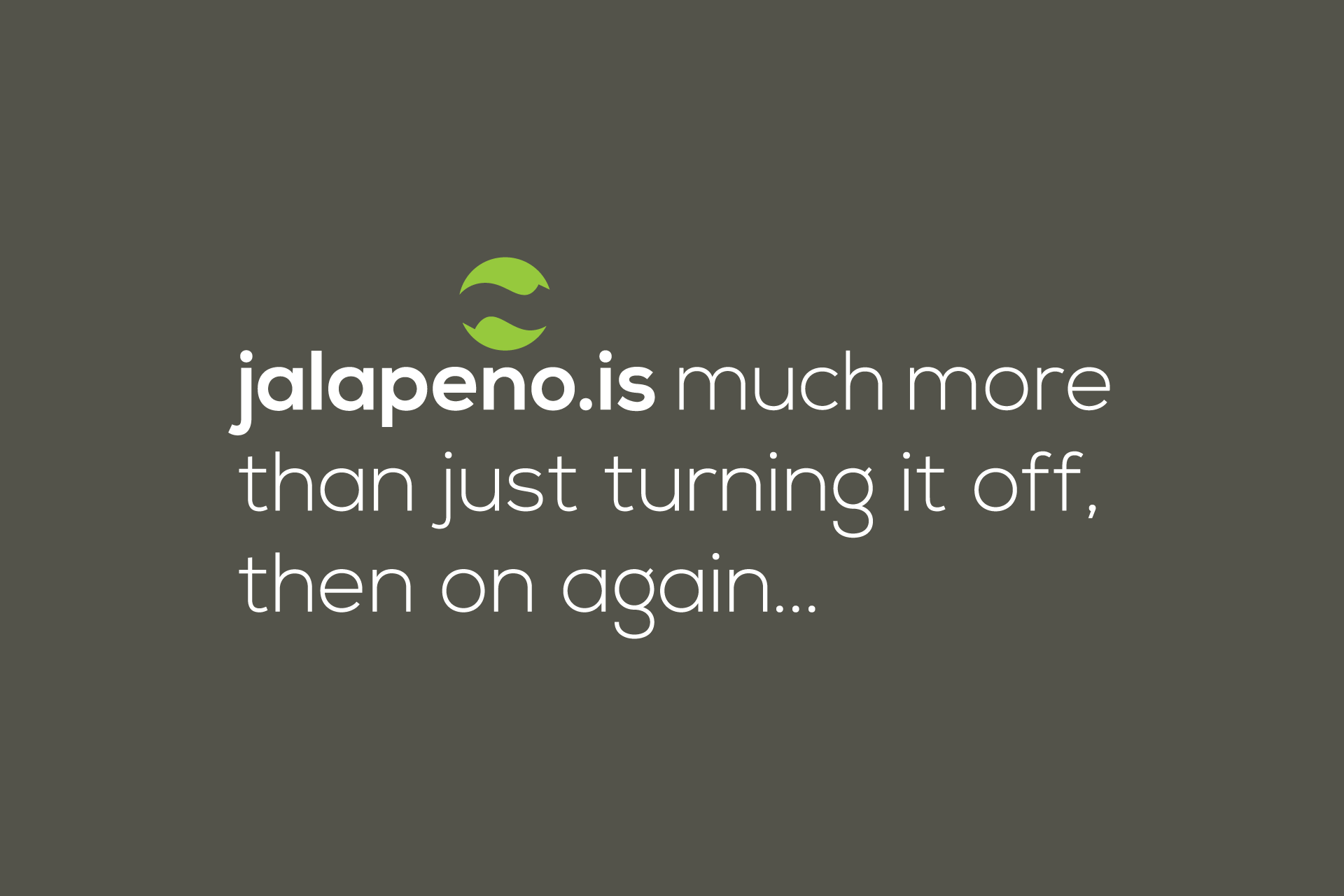
The main challenge of this project was to create a modern looking identity and website that represented the business name without it looking like a Mexican restaurant or a company that sells hot sauces.
Solution
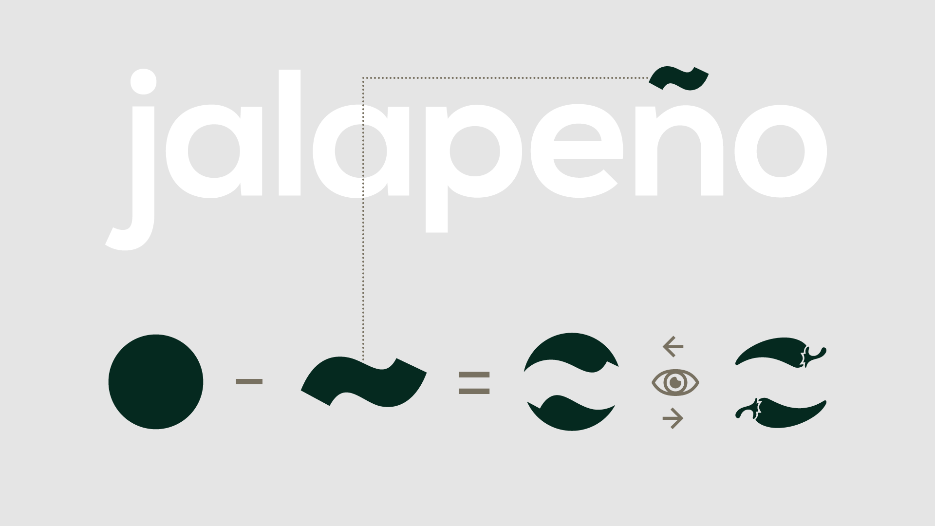
I began the project by exploring the word and experimenting with modern typefaces to give it that clean, minimal look. Through this I discovered that the ‘tilde’ (the accent above the n) features in the name but not the website url. This left me thinking it needed to feature elsewhere in the identity and began playing around with the tilde shape in isolation.
It was while containing the tilde within in a circular shape that I first spotted it — that wonderous moment of serendipity when the pieces literally fell into place to reveal exactly what you were looking for — discovering that the negative space left when the tilde is dissected from the circular shape clearly resembled two jalapeno peppers. Not only connecting with the business name but also reflecting the two founding members of the business.
I call this project “my Fedex moment”, with the positive and negative shapes not always immediately noticeable, but once you see it, it creates that little “smile in the mind” that makes it far more memorable.
Sometimes it’s just having the presence of mind to be able to spot these serendipitous events when the occur.