Lille Healthcare
Rebranded packaging design for international healthcare client
Studio
Default Blue
Client
Ontex Healthcare
Sector
Healthcare
Services
Branding
Packaging Design
Background
Back in 2015, as the creative lead at Default Blue, we won the opportunity to rebrand a range of personal healthcare products that are manufactured in their millions and distributed across multiple European territories.
Brief
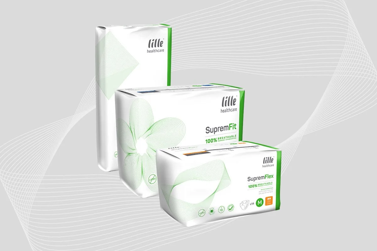
The brand new 100% breathable material was to be the main focus of the rebranded packaging design.
Solution
Presenting three concepts — a perfectly safe evolution, a more radical reworking of their existing brand style and our third and final “wild card” entry — the client initially went for somewhere between options 1 and 2. Until the MD stepped in and decided that “simple change” wasn’t enough and opted for our Wild Card option.
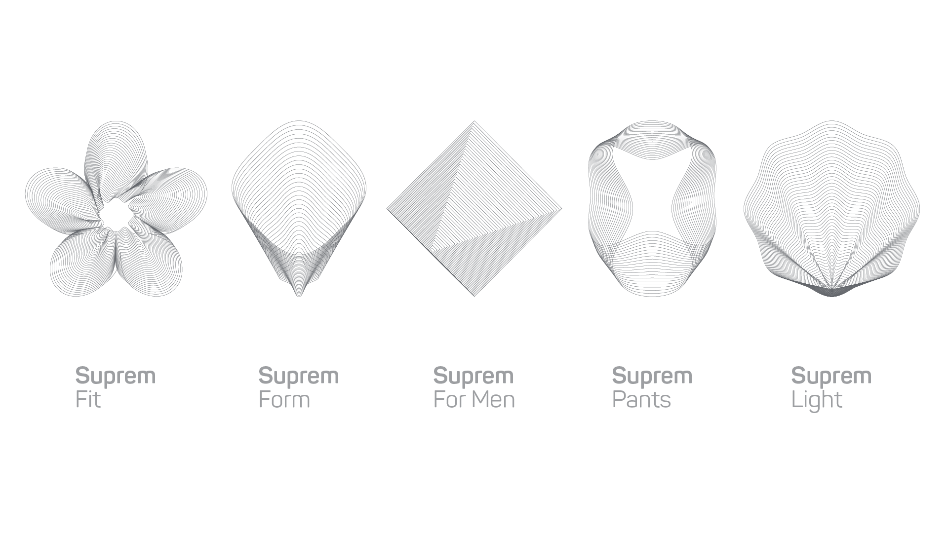
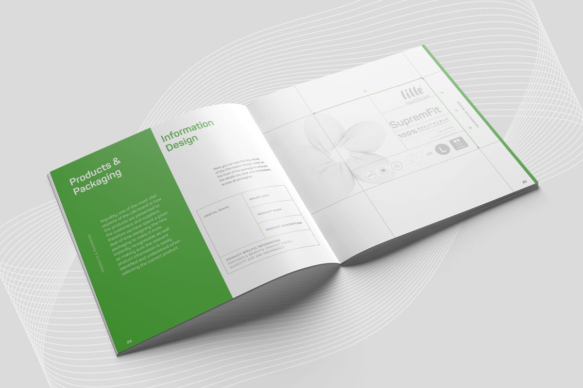
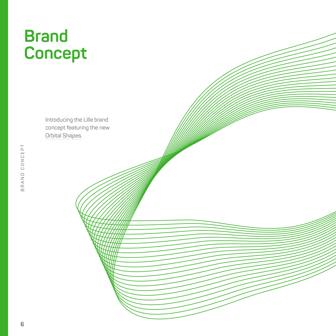
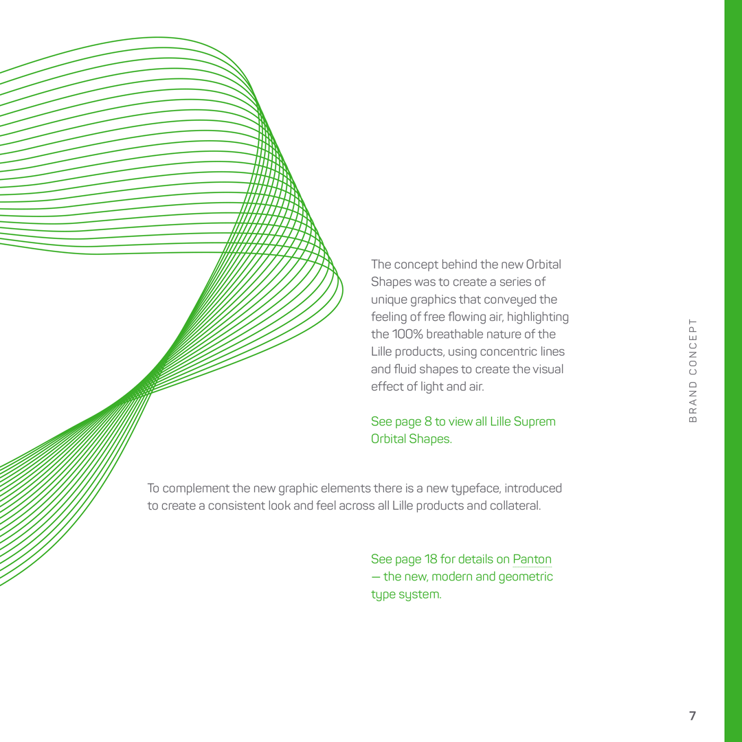
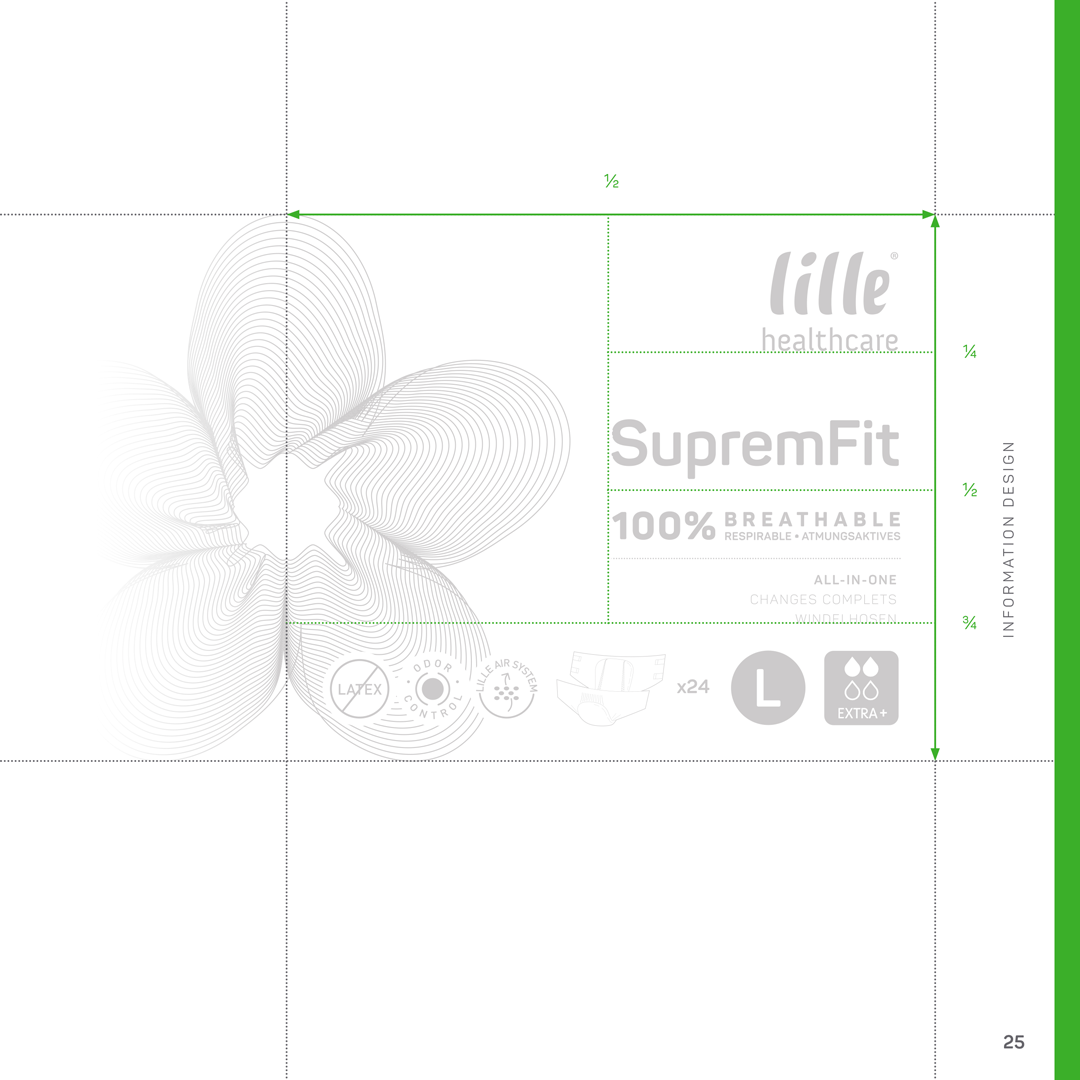
The concept behind this was focused on the 100% breathable nature of the product, creating a range of uniquely shaped linear style graphics that resembled isobars/lines on a weather map to visualise the flow of air and the benefits of breathability.
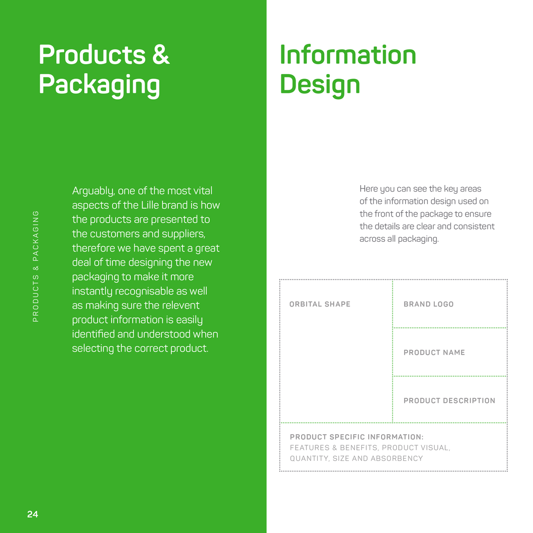
These “orbital shapes” were applied across all packaging and promotional materials, as outlined by the detailed design framework created as part of the overall brand guidelines.