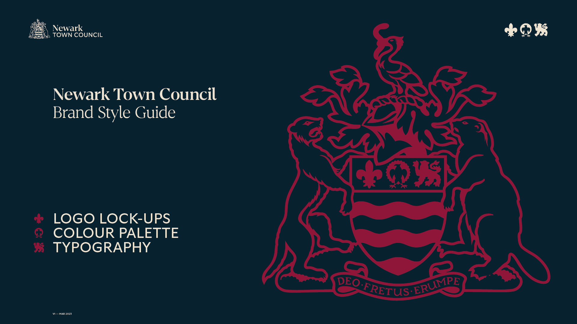
Newark Town Council
Updated logo and brand style guide for local town council
Studio
Brand Newark
Client
Newark Town Council
Sector
Local Authority
Services
Brand Development
Logo Design
Background
As a result of successfully completing several projects with Newark and Sherwood District Council, I was invited to discuss the update of the Newark Town Council logo and identity.
Brief
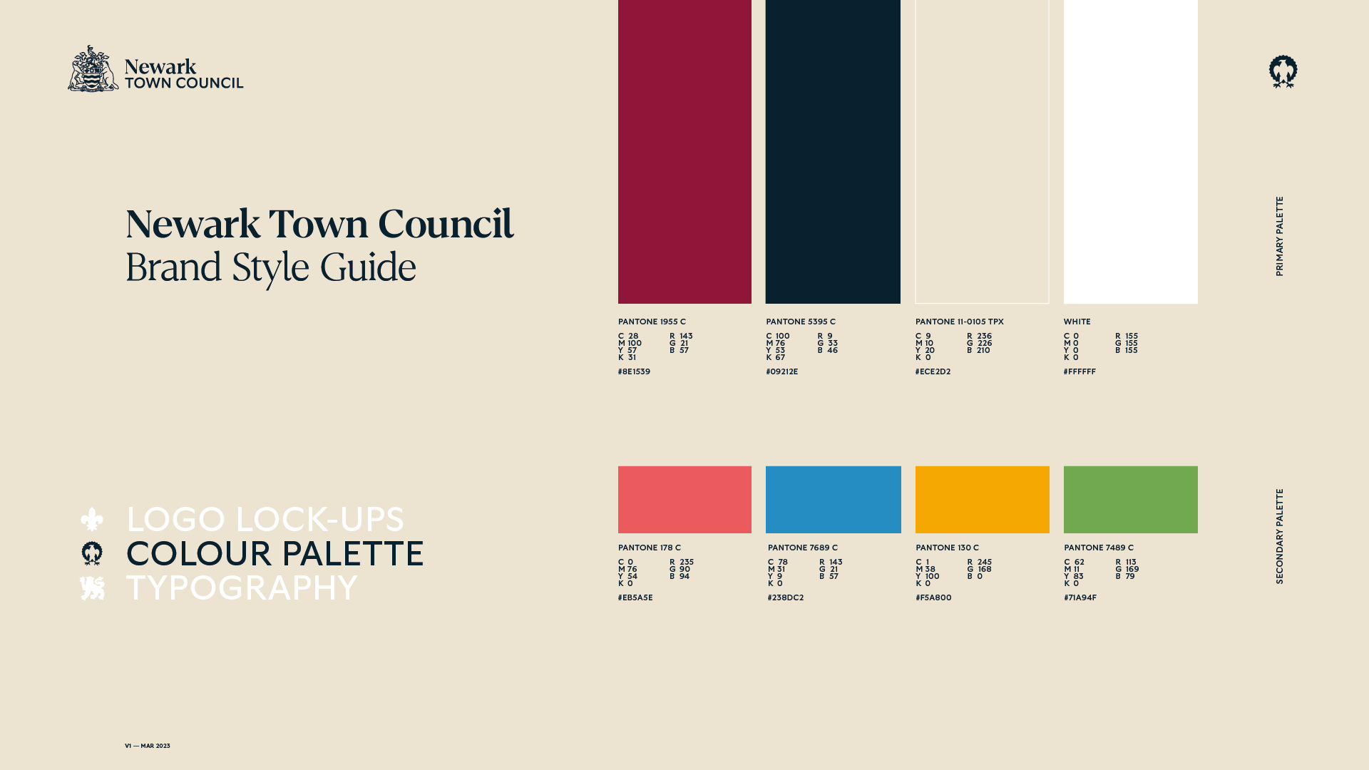
While the overriding brief was to modernise the logo and make it more flexible for use across all digital and print applications, the town of Newark is steeped in history, so any update needed to remain sympathetic to this.
Solution
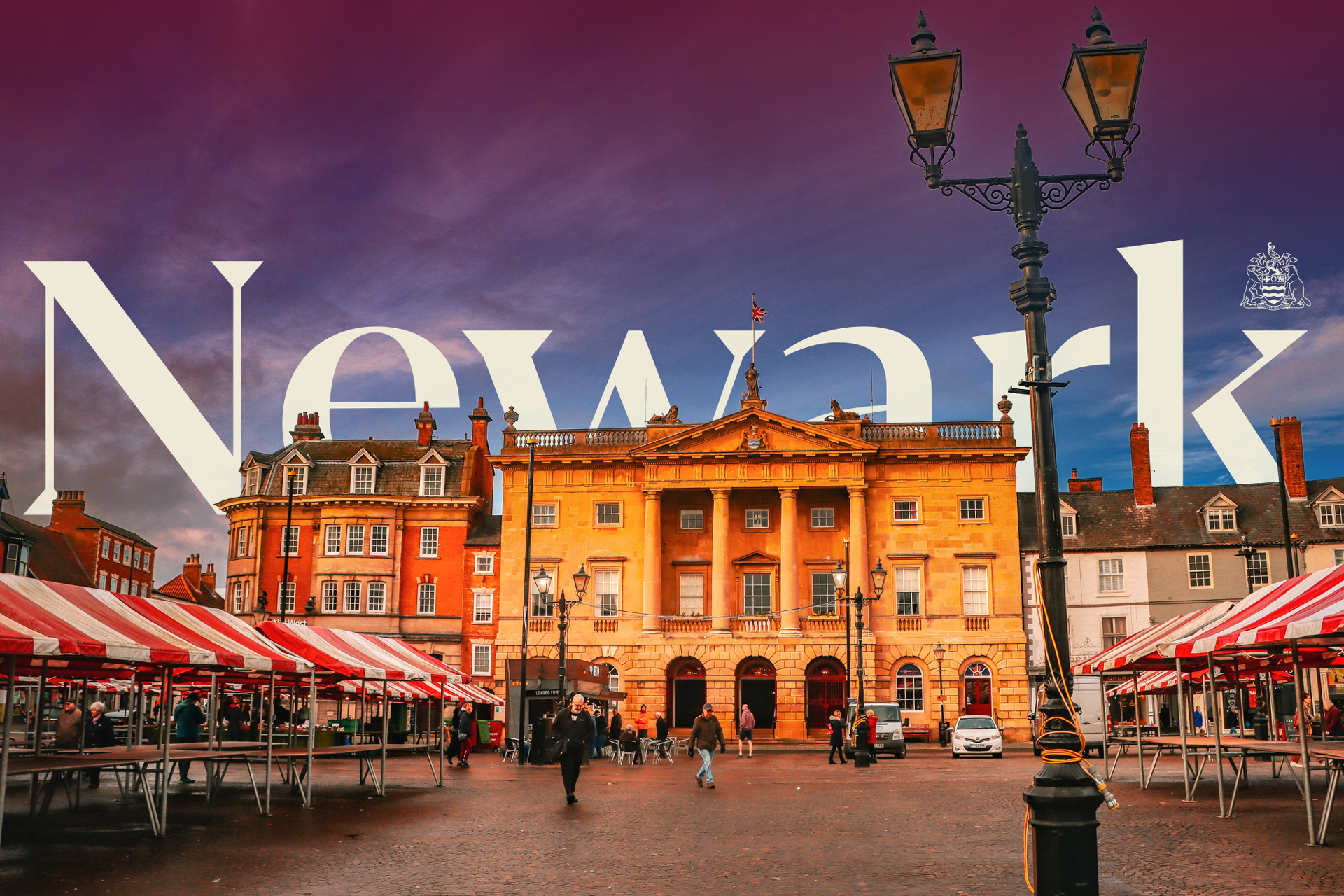
Researching the heraldry of the established town crest led to different ideas of how it could be pulled apart and reconstructed, but each of those options seemed to take it too far away from the historical roots of the town. This led to a change of direction and the decision to keep the crest, but strip it back to a simple one-colour version to increase its legibility when scaled down, and retain its long-established recognisability.
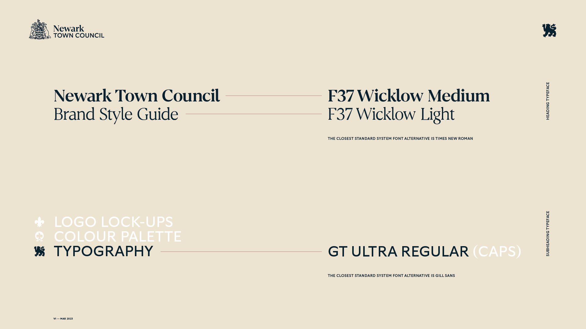
This allowed for the modernisation to be brought in through the typography with the selection of two new typefaces. To define the town itself, I wanted the word ‘Newark’ to be a modern interpretation of the type featured in the previous logo and displayed around the town on various signs and points of interest. The ultimate choice for this was Wicklow from F37 Foundry. This was complemented perfectly with GT Ultra Regular from Grilli Type.