Ace Safety Training
Identity and style guide for a safety training consultancy
Studio
Default Blue
Client
Ace Safety Training
Sector
Training Services
Services
Brand Identity
Background
Originally helping Ace Assist Ltd launch their new online training service back in 2018, they came back to us once again in 2023 to rebrand and relaunch with a wider range of opportunities as Ace Safety Training.
Brief
Rename and rebrand with a focus on safety training courses — both online and on site — while also considering the consultancy side of the business.
Solution
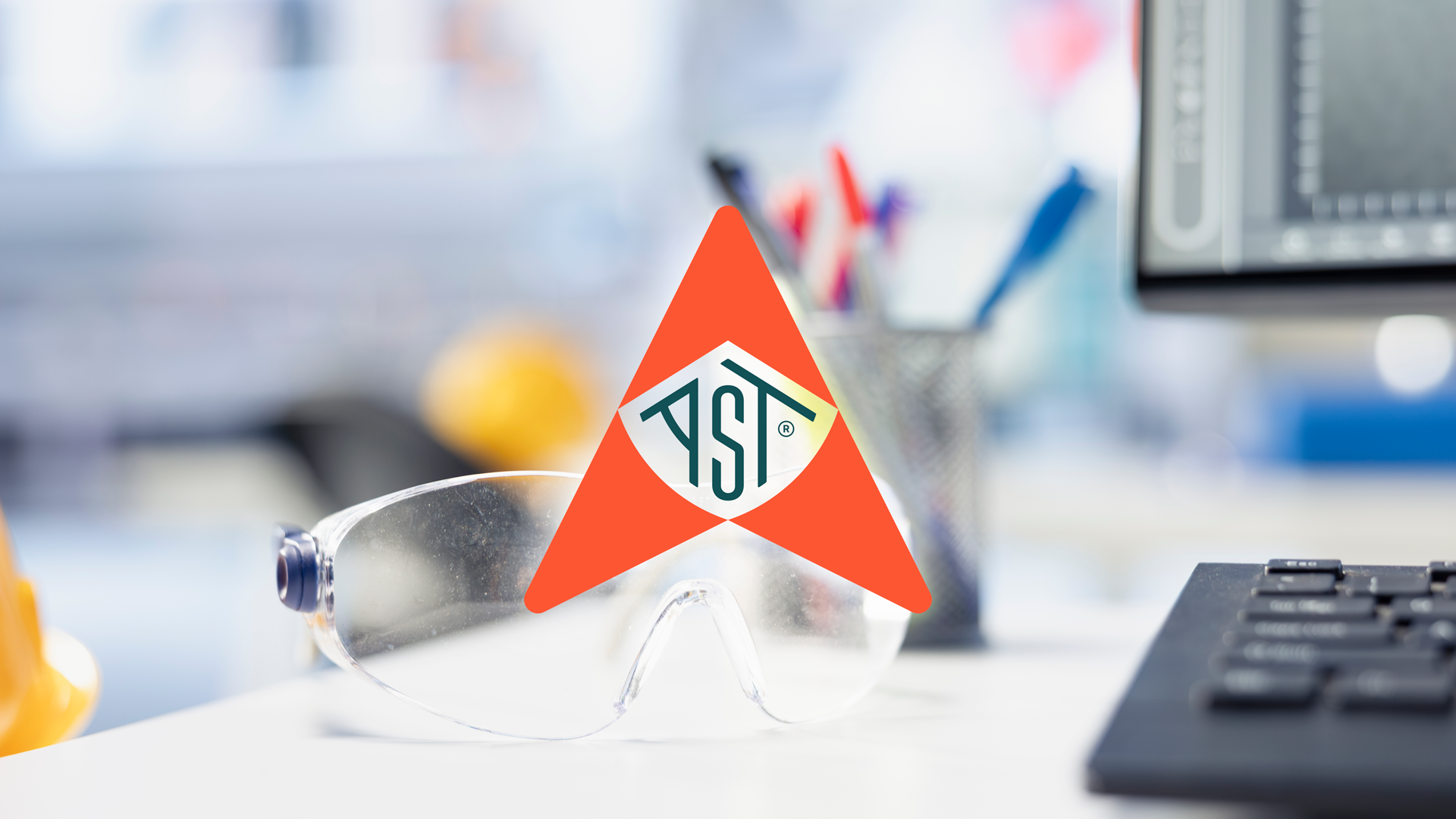
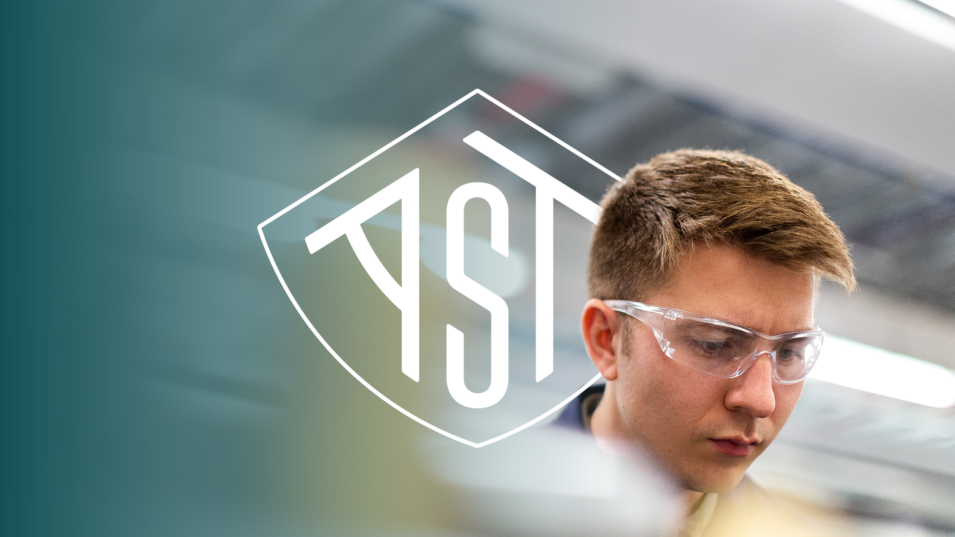
With a clearer focus on providing safety training, this gave me the idea to create a logomark that resembled a kitemark or stamp that provides visual connotations of official certification. Following that, I developed and applied colour palette and typography that provides clarity and assured safety.
Packaging it all together with simple, yet comprehensive, style guide and a suite of brand assets to support the launch of this new business.